
How to Use Colors to Boost Engagement on Instagram
Colors play a crucial role in shaping human emotions, perceptions, and decisions. On Instagram, where visuals reign supreme, understanding how to use colors strategically can significantly enhance your content's engagement levels. From choosing the right palette to invoking specific emotions, this article will guide you on how to make colors work for you and why our services can help elevate your Instagram strategy.
1. The Psychology of Colors in Instagram Marketing
Colors are not just aesthetic elements; they communicate meaning and evoke emotions. By understanding color psychology, you can align your content with your brand’s goals and resonate with your audience.
Key Emotional Associations of Colors
- Red: Passion, urgency, and excitement. Ideal for promotions or calls to action.
- Blue: Trust, calmness, and professionalism. Perfect for corporate or health-related content.
- Yellow: Happiness, optimism, and energy. Great for lifestyle and uplifting posts.
- Green: Growth, health, and harmony. Works well for eco-friendly or wellness brands.
- Black: Luxury, elegance, and sophistication. Best for high-end product promotions.
- White: Simplicity and purity. Adds a clean, minimalist feel to your content.
👉 Pro Tip: Use contrasting colors to make text or call-to-action buttons stand out in your posts.
2. How Colors Affect Instagram Engagement
A. Catching Attention
Bright and bold colors naturally draw the eye, making your posts more noticeable in crowded feeds.
B. Influencing Decisions
Colors can subtly guide users toward desired actions, such as clicking a link or purchasing a product. For instance:
- Using red in “Buy Now” buttons can create a sense of urgency.
- A green checkmark can reinforce trustworthiness.
C. Reinforcing Brand Identity
Consistent use of brand colors helps establish a recognizable identity, increasing trust and loyalty among your followers.
3. Strategies to Use Colors Effectively on Instagram
A. Choose a Cohesive Color Palette
A consistent color scheme across your posts creates a visually appealing profile. Tools like Adobe Color or Canva can help you select a palette that aligns with your brand.
B. Leverage Contrasts for Readability
Ensure that text overlays on images are easily readable by using contrasting colors. For example, white text on a dark background enhances clarity.
C. Use Color Gradients in Stories
Instagram Stories allow for creative use of gradients, which can make your content more dynamic and engaging.
D. Highlight CTAs with Bright Colors
Make calls to action (e.g., “Swipe Up” or “Shop Now”) stand out by using vibrant, attention-grabbing colors like orange or red.
E. Seasonal Color Themes
Adapt your palette to match seasonal trends or holidays, such as red and green during Christmas or pastels in spring.
4. Examples of Using Colors for Specific Goals
A. Increasing Engagement with Vibrant Colors
Brands in the fashion or food industry often use bright yellows, reds, and pinks to evoke excitement and energy.
B. Establishing Trust with Neutral Tones
Healthcare or financial brands benefit from cool tones like blue and gray, which convey reliability and calmness.
C. Inspiring Action with Contrasts
Fitness influencers use high-contrast color combinations, such as neon green on black, to energize and motivate their audience.
5. How Our Services Can Help You Optimize Your Color Strategy
Crafting a visually cohesive Instagram account takes time and expertise. Here's how we can assist:
A. Customized Visual Strategies
We analyze your brand and audience to develop a tailored color strategy that maximizes engagement.
B. Professional Content Creation
Our team designs high-quality, visually stunning posts, stories, and ads with strategically chosen color schemes.
C. Consistent Branding
We ensure that your feed maintains a cohesive aesthetic, making your account instantly recognizable.
D. Data-Driven Insights
With advanced analytics, we monitor which colors and styles resonate most with your audience, allowing you to refine your approach.
6. Real-Life Success Stories
Case Study 1: Fashion Brand
A small boutique leveraged our services to redesign their Instagram feed with a vibrant pink and orange palette. Within two months, they saw a 45% increase in engagement and a 30% boost in sales.
Case Study 2: Wellness Coach
A wellness coach used calming greens and blues in their posts, reinforcing their brand’s mission. Our team’s strategic use of color gradients in stories doubled their follower interactions.
7. Practical Tips to Implement Today
- Audit Your Feed: Identify which colors dominate your current posts and adjust if necessary to align with your brand.
- Experiment with Gradients: Test different color transitions in your stories for more dynamic visuals.
- Analyze Competitors: See how successful accounts in your niche use colors and adapt those strategies.
8. Why Invest in Professional Services?
Instagram is a competitive platform, and standing out requires more than just good content—it requires strategic design. By working with us, you gain:
- Expertise in visual storytelling.
- Access to professional designers and marketers.
- Time to focus on your core business while we handle your Instagram strategy.
Visit 1MillionSocial.com to learn more about our tailored Instagram services.
Conclusion
Colors are powerful tools for capturing attention, conveying emotions, and driving actions on Instagram. By strategically using colors in your posts, stories, and ads, you can boost engagement and build a loyal community.
Ready to transform your Instagram game? Let us help you design a color strategy that resonates with your audience and grows your brand. Contact us today!
Popular Post

25 Nov, 2024
John Sparks' : How 1millionsocial.com Tr...

25 Nov, 2024
1.450 Million Followers and Made $390,00...

25 Nov, 2024
$320,000 in Revenue in His First Year wi...

25 Nov, 2024
Do Free Followers Impact User Engagement...

25 Nov, 2024
The Best Strategies to Attract Free TikT...

25 Nov, 2024
Are Free TikTok Followers Real?
25 Nov, 2024
Top Apps for Gaining Free TikTok Followe...

25 Nov, 2024
How to Gain Free TikTok Followers with S...

25 Nov, 2024
The Impact of Free Followers on TikTok A...

25 Nov, 2024
Is Getting Free Followers for TikTok Saf...

25 Nov, 2024
What Are Free TikTok Followers, and How...
25 Nov, 2024
Is Buying TikTok Followers Beneficial fo...
25 Nov, 2024
Affordable TikTok Follower Plans: The Ke...
25 Nov, 2024
How Buying TikTok Followers Can Help Gro...
25 Nov, 2024
The Difference Between Buying TikTok Fol...
25 Nov, 2024
Does Buying TikTok Followers Boost Engag...

25 Nov, 2024
Key Considerations Before Buying TikTok...

25 Nov, 2024
The Pros and Cons of Buying TikTok Follo...

25 Nov, 2024
Why Buying TikTok Followers is the Perfe...

25 Nov, 2024
Does Follower Count on TikTok Influence...

24 Nov, 2024
a 32-Year-Old Sexual Wellness Educator i...

24 Nov, 2024
Luis Buckner’s Hang Gliding Business: Ho...

24 Nov, 2024
Justina Shields: Mastering Chess with So...

24 Nov, 2024
The Best Tools for Gaining Free Follower...

24 Nov, 2024
How to Gain More Followers on TikTok Usi...

24 Nov, 2024
The Importance of Increasing Followers f...

24 Nov, 2024
Understanding the Difference Between Rea...

24 Nov, 2024
10 Top Strategies for Attracting Targete...

24 Nov, 2024
Organic Methods to Increase TikTok Follo...

24 Nov, 2024
The Impact of TikTok Followers on Accoun...
24 Nov, 2024
How to Attract Real TikTok Followers and...

24 Nov, 2024
How to Revive Old Content and Make It En...
24 Nov, 2024
Strategies to Combat Declining Engagemen...

24 Nov, 2024
Does the Number of Followers Impact Prod...
24 Nov, 2024
Key Tips for Enhancing Your Instagram Pr...

24 Nov, 2024
How Polls and Questions in Stories Can T...

24 Nov, 2024
The Role of Educational Content in Growi...

24 Nov, 2024
How to Turn Your Audience into Loyal Fol...
24 Nov, 2024
Proven Strategies to Boost IGTV Views on...

23 Nov, 2024
John Booth: Illuminating Wisconsin with...
23 Nov, 2024
Elaine McHone: Crafting a Nail Art Empir...

23 Nov, 2024
Manuel Hornback: Gaming His Way to Fame...

23 Nov, 2024
Does Instagram’s Algorithm Prevent Fake...

23 Nov, 2024
How Responding to Direct Messages Can Bu...
23 Nov, 2024
The Role of Online Contests in Boosting...

23 Nov, 2024
Effective Advertising Strategies for Ins...

23 Nov, 2024
How to Use Instagram Data for Market Ana...
23 Nov, 2024
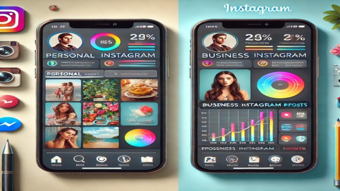
The Key Differences Between Business and...
23 Nov, 2024
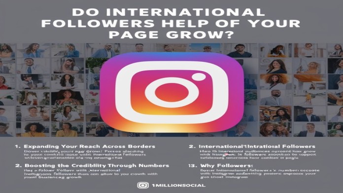
Do International Followers Help Your Ins...
23 Nov, 2024
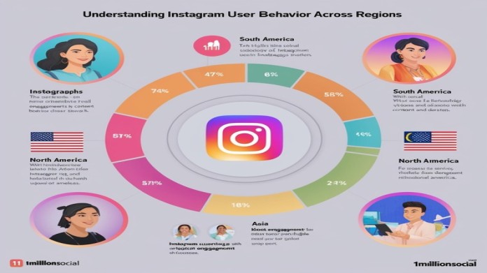
Understanding Instagram User Behavior Ac...
23 Nov, 2024
Top 10 Apps for Managing Instagram Accou...

23 Nov, 2024
The Impact of Location Tags on Increasin...

23 Nov, 2024
How to Optimize Your Instagram Page for...

23 Nov, 2024
The Latest Instagram Algorithm Changes a...

23 Nov, 2024
Professional Strategies for Managing Bus...
23 Nov, 2024
How to Effectively Promote Your Products...

23 Nov, 2024
Why Short Videos on Instagram Deliver Hi...

23 Nov, 2024
The Role of Influencer Marketing in Busi...

23 Nov, 2024
Successful Instagram Marketing Campaigns...

22 Nov, 2024
Manuel Hornback: Gaming His Way to Fame...

22 Nov, 2024
Charles Sussman: Mastering the Art of Ma...

22 Nov, 2024
Carolyn Wilson: Blossoming as a Bridal M...

22 Nov, 2024
How to Attract Targeted Followers with S...
22 Nov, 2024
Winning Instagram Marketing Strategies f...

22 Nov, 2024
Comprehensive Review of Instagram Analyt...

22 Nov, 2024
Why Instagram Is a Crucial Platform for...
22 Nov, 2024
The Role of Engaging Captions in Boostin...

22 Nov, 2024
How to Use Instagram Reels to Attract Mo...
22 Nov, 2024
The Impact of Instagram Stories on Growi...

22 Nov, 2024
The Best Methods for Instagram Advertisi...

22 Nov, 2024
How to Find the Right Hashtags for Boost...
22 Nov, 2024
The Secrets to Instagram Success in 2024
22 Nov, 2024
Are Free Instagram Follower Websites Eff...

22 Nov, 2024
How to Get 10 Free Instagram Followers:...

22 Nov, 2024
How Large Instagram Pages Benefit from O...

22 Nov, 2024
The Impact of High-Quality Content on Or...

22 Nov, 2024
How to Build Genuine Connections with Re...

22 Nov, 2024
The Role of Storytelling in Driving Orga...

22 Nov, 2024
Why Does Instagram's Algorithm Favor Org...

21 Nov, 2024
Cameron Clark: Cultivating Success in Ne...

21 Nov, 2024
Johnny Lerman: Teaching Tennis to the Wo...

21 Nov, 2024
David Sykes: Transforming an Oregon Bar...

21 Nov, 2024
The Best Methods for Increasing Engageme...

21 Nov, 2024
10 Strategies for Organic Instagram Grow...
21 Nov, 2024
Organic Content Creation: The Key to Ins...
21 Nov, 2024
How to Gain Instagram Followers Without...
21 Nov, 2024
Organic Growth on Instagram: Why It Matt...

21 Nov, 2024
Exploring Instagram Follower Plans: Whic...

21 Nov, 2024
How to Boost User Engagement with Instag...

21 Nov, 2024
Does Buying Instagram Followers Help Inc...

21 Nov, 2024
Buying Instagram Followers for Small Bra...

21 Nov, 2024
How to Choose the Best Instagram Followe...
21 Nov, 2024
Comparing Real Followers vs Fake Followe...

21 Nov, 2024
Does Buying Instagram Followers Help Org...

21 Nov, 2024
Key Tips for Buying Instagram Followers...

21 Nov, 2024
Why Buying Instagram Followers is the Be...
21 Nov, 2024
How to Increase Product Sales with Free...

21 Nov, 2024
The Impact of Free Followers on User Eng...

21 Nov, 2024
Are Free Follower Apps Safe? A Closer Lo...

20 Nov, 2024
Marquitta Kilgore: Rising to Stardom as...
20 Nov, 2024
Hector White’s Rise to Fame in the Adult...

20 Nov, 2024
Alissa Bell’s Tattoo Service Revolution:...
20 Nov, 2024
The Secret to Successfully Gaining Free...

20 Nov, 2024
Do Free Instagram Followers Hurt Organic...
20 Nov, 2024
How Free Instagram Followers Can Help Bo...
20 Nov, 2024
How to Get Free Instagram Followers With...

20 Nov, 2024
Are Free Instagram Followers Reliable? W...

20 Nov, 2024
Why Educational Videos Get the Most View...

20 Nov, 2024
The Difference Between Real and Fake Ins...

20 Nov, 2024
The Role of Hashtags in Increasing Insta...
20 Nov, 2024
How to Create Engaging Video Content to...

20 Nov, 2024
The Secret to Success for Instagram Page...
20 Nov, 2024
Buying Instagram Views: Is It Effective?

20 Nov, 2024
Why More Instagram Views Help Your Page...

20 Nov, 2024
Increasing Instagram Reels Views: The Ul...

20 Nov, 2024
Free Increase Instagram Video Views: The...

20 Nov, 2024
How to Increase Instagram Story Views: A...

20 Nov, 2024
Introduction: The Importance of Distingu...

20 Nov, 2024
The Power of the Like: How Likes Fuel Pe...

19 Nov, 2024
Henry Lawson's Digital Entrepreneurship:...

19 Nov, 2024
Dorothy Castellano’s Jewelry Auction Emp...

19 Nov, 2024
John Laing’s Rise in Content Creation:Ha...
19 Nov, 2024
Instagram Likes: Why Do Users Engage Mor...
19 Nov, 2024
10 Ways to Organically Attract Likes on...

19 Nov, 2024
How to Get More Likes on Instagram with...

19 Nov, 2024
Are Purchased Likes Valuable? Unlocking...

19 Nov, 2024
Best Time to Post on Instagram for More...

19 Nov, 2024
How Instagram Likes Impact Your Business...

19 Nov, 2024
Common Mistakes Killing Your Instagram L...

19 Nov, 2024
How to Increase the Number of Likes on Y...

19 Nov, 2024
Is Buying Instagram Followers Essential...

19 Nov, 2024
The Best Website for Buying Social Media...

19 Nov, 2024
The Power of Real Followers: Building In...

19 Nov, 2024
How to Attract More Instagram Followers...

19 Nov, 2024
Organic Instagram Follower Growth: Why I...
19 Nov, 2024
10 Proven Methods to Increase Instagram...
19 Nov, 2024
Get Free Instagram Followers: The Ultima...

19 Nov, 2024
Your Ultimate Guide to Boosting Online P...

19 Nov, 2024
Buy Real Social Media Followers,Likes,an...

03 Feb, 2021
Maria Powell’s Home-Based Piercing Busin...

03 Feb, 2021
Francisco Emerson’s Journey: Turning Pas...

03 Feb, 2021